It’s no secret that people are using their tablets and mobile phones more and more to browse and shop online. It is important to offer these non-desktop users the best possible experience to help increase conversion rates on your website. Before I get deeper in to the details and reasoning for why to have both, here is some background information for some of the terminology used in this post:
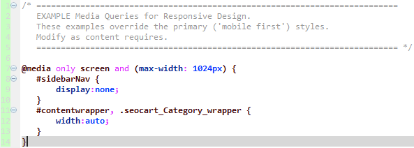
Responsive Template: A fluid website template that is optimized for all devices no matter the screen resolution. The trick to building a responsive website template is the use of the css3 media queries and a special meta tag in the website header. The goal of a responsive template is to prevent horizontal scrolling and constant zooming in/out when browsing a website on your phone, tablet, or other device. As the screen width gets smaller, certain elements on the page are hidden or rendered differently to prevent horizontal scrolling and elements are stacked vertically instead of floated beside each other.
Mobile Template: A website template served specifically for users accessing your website from a smart phone. First, the mobile device is typically detected on the server side with a regular expression based on the browser’s user agent. If a mobile device is detected, then the user is either redirected to the mobile version of the website via a subdomain, or (preferably) the mobile template is dynamically loaded over the primary domain, overriding the classic responsive template.
E-commerce Conversion Rate: In the e-commerce world, your conversion rate is the percentage of customers who actually buy something from your website. This percentage is determined by using the number of unique visitors who visit your website within a specified time period. The higher your conversion rate, the more orders you are getting.
You might be asking, why do I need both a responsive template AND mobile template? After all, a proper responsive website template should work across the board no matter what device is used. This is correct, but with a mobile template, the page load time is a very important factor. Most mobile users are on a slower connection than non-mobile users. Mobile phones also do not have as much memory and CPU power as other devices.
Compared to a mobile template, a responsive template will typically have much more javascript, CSS, and more HTML elements to load on a page. The more there is, the longer it will take for the page to load. The advantage of adding a mobile only template is that you have much more control over what is loaded on the page.
Even though it is more work to create and manage both a responsive and mobile website template, the extra work will pay off over time and keep your customers coming back. The good news is that SEO-Cart makes it easy to work on your responsive and mobile templates and does a lot of the grunt work for you already.
SEO-Cart automatically detects a user’s device, such as smart phone or tablet, and serves your mobile template to the user across your primary domain, without redirecting the user or showing them any pesky mobile alert messages.
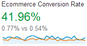
In almost all cases, serving an optimized mobile template instead of your responsive website template will load pages orders of magnitude faster for your smart phone users. A faster page load time means less frustration for customers and higher commerce conversion rates.
Within our ecommerce software you can work on and preview both your main website template and mobile (portrait and landscape modes) website template, without even lifting up your phone.
Google also has interest in websites who optimize for all devices. This means that your organic search rankings can improve as you continue to provide the best possible experience to your customer base.