Mobile usage is increasing. We all know it’s happening and mobile/tablet usage should continue to grow. Google knows this and is letting others know through recent software updates to Chrome and Webmaster Tools. If your existing website is outdated and not optimized for mobile and other non-desktop devices, you could be losing out on traffic and it could also even be cutting in to your organic placements within search engine result pages.
Mobile Usability within Webmaster Tools
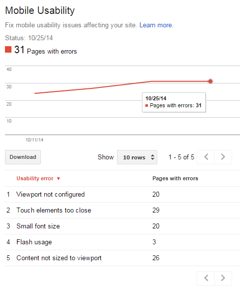
Google released an update to Webmaster Tools today to track mobile usability / website responsiveness to other screen devices. This information is wonderful to have, especially if your website is already responsive so you can view more detailed errors and warnings. You can now review mobile usability errors, such as:
- Viewport not configured
- Touch elements too close
- Content not sized to viewport
- Small font size
- Flash usage
You can click on each error and view the exact pages the error was detected on. Awesome! It will be interesting to see if Google adds any more errors for existing websites that are responsive and optimized for more than one screen resolution.
Google Chrome Adds More Mobile Support for Developers
The webmaster tools update comes after a pretty big update to Google Chrome developer tools which includes more emulation features for emulating your website on other devices.
Google Chrome Developer tools now includes a “toggle device mode” button to enable better emulation and responsive information about the website:
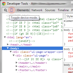

The new and improved emulation toolbar allows you to more easily select your device, rotate between portrait and landscape modes, and view existing responsive CSS rules for each configured viewport. Rock on!
Where is mobile heading?
We at Cirkuit Networks believe that mobile optimization is a huge step towards making your website more user friendly and search engine friendly. Being mobile friendly also helps increase your order conversions on your e-commerce website. If you already have an existing website and are looking to make it more modern and mobile friendly, sign up for a free SEO-Cart trial at www.seo-cart.com or contact us to get started today.