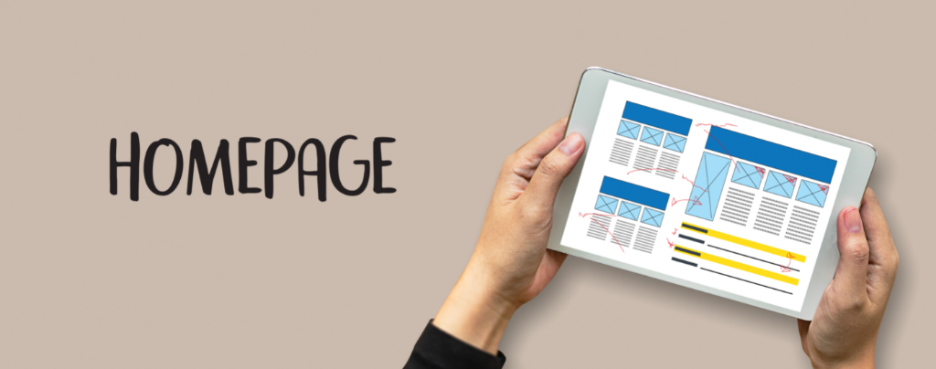
Designing a homepage that converts visitors into buyers is essential for eCommerce websites. With so much to offer, it’s tempting to include as much information as possible on your homepage, but including too much information will overwhelm and confuse visitors resulting in the visitor bouncing. The key to conversion is to keep your homepage simple.
Design a Simple Homepage to Convert Visitors into Buyers
Websites with simple designs have higher conversion rates. A simple homepage is branded, concise, easy to navigate, and provokes action.
Simple homepages that convert visitors into buyers consider the following:
Page Elements
Google research has found that the number of elements on a page was the greatest predictor of conversions. Page elements are used to create the structure of a webpage and present information in various ways. The most common elements are headings, paragraphs, links, images, videos, and buttons. The more elements on a page, the greater the page’s weight and complexity. Webpages that have many elements are considered complex and lead to fewer conversions.
Images
For a simple homepage, use quality images and use them sparingly. Websites without quality images come across as unprofessional. Too many images will cause the page to load slowly and lead to a low conversion rate.
Research from Google has found that the number of images on a page was the second greatest predictor of conversions.

Tip: Not all image types are equal. For a faster loading webpage, scale large images down and use lossy JPEG compression (70-90% quality). This will shrink image file size without sacrificing visual quality. For small icons, consider using Font Awesome or inline SVG images instead of loading dozens of individual PNG/GIF/JPEG images.
Hero Shot
The homepage’s main image, also referred to as the hero shot, will likely be the largest, most prominent element on your homepage. Through a combination of verbal and visual elements, your hero shot should complement your brand and send a clear message.
Headline
The homepage headline makes a very important statement. Headlines are often found above, below, or within the hero shot.
Navigation Bar
The navigation or menu bar is a crucial element of web design. A navigation bar with minimal options is best. Per Hick’s Law, the risk of information overload rises when website visitors encounter too many options. Design your navigation bar so visitors can quickly find what they are looking for. If visitors stall in the decision making process, they may end up leaving your website.
The navigation bar’s sole purpose is to guide visitors while they navigate the site. A good guide is straightforward, organized, and friendly. Start with five to seven primary navigation options that incorporate the most important information visitors are looking for.
For eCommerce websites, your most important categories should form the primary headings of your menu. List subcategories as needed. Group navigation bar items into categories that expand as the visitor selects the option they are looking for.
Tip: Design a sticky (or fixed) navigation menu that remains locked in place when visitors scroll down the page. Sticky navigation bars make browsing faster resulting in the site being quicker to navigate. They also help to maintain your brand throughout your website.
Search Box
Easy product discovery is an essential key in conversion. A search box provides visitors with a friendly way to find the products they are looking for quickly.
Call-To-Action
A call-to-action (CTA) button encourages visitors to act. Your CTA should be obvious and compelling. Having more than one CTA is discouraged. Numerous CTAs are not as effective as they are asking the visitor to act upon more than one thing. eCommerce websites are typically trying to sell a product and the CTA should reflect that. The most common CTAs for eCommerce websites are Buy, Shop, Order Now, Reserve, Save, Add to Cart, Pick, and View.
Color
 One of the most powerful tools in a designers toolbox is color. Color can have a dramatic impact on conversion rates because of color’s influence on behavior. Refer to the principals of color theory to create harmonious color combinations and understand the different ways colors can be used. In addition to color theory, consider the findings of color psychology to understand how color effects mood, behavior, and feelings. To influence visitors into becoming buyers, incorporate both color theory and color psychology in your website color scheme design.
If your company already has an established color scheme and brand, it’s essential to include it on the homepage and throughout the website consistently. Establish a web design color palette that complements your brand. Incorporate the web design color palette into the web elements that you want to draw attention to. A common mistake when designing with colors is to use too many of them, so use color sparingly.
Speed
The speed at which your homepage loads will affect bounce and conversion rates. Websites that load slowly will cause visitors to leave.
Use PageSpeed Insights to test the speed of your homepage. PageSpeed Insights is an online tool that is part of Google’s PageSpeed Tools designed to help website performance optimizations. PageSpeed Insights helps identify performance best practices, provides suggestions on webpage optimization, and suggests overall ideas on how to make a website faster.
Footer
A fat footer is a good way to provide a quick overview of the most important pages of your website. It is common for contact information to be found in the footer.
Social Media
Include social media icons that link to your social media profiles to help visitors find and connect with you. Common placement for social media icons are above the fold or in the footer.
If you are actively using social media (you should be!), consider integrating a feed from your most commonly used and liked social media profile on your homepage. For example, we offer an easy Social Media Integration Plugin for all of our websites.
Testimonials
Testimonials are powerful social proof objects that lead to conversion. Including at least two testimonials on your homepage will do the trick. If you have many testimonials, a separate testimonial page will add social credibility and result in more buys.
Newsletter Sign-up
Email marketing is one of the best and most enduring tools for converting visitors into buyers. Invite visitors to sign-up to receive newsletters and specials from your business on your homepage. The footer is a common place to find newsletter signup forms.
Stay “Above the Fold”
The concept of “above the fold” dates back centuries to the early days of publishing. “Above the fold” was a term used for content that appeared on the top half of the front page of a newspaper. When it comes to websites, “above the fold” or “above the scroll” refers to the content that is visible before scrolling.
Studies have consistently shown that people spend the majority of their time “above the fold”.
There are key elements that should be placed “above the fold” on a homepage that convert leads. These key elements are:
- Company branding – name, logo, tagline, or other visual identifying information
- Navigation bar
- Call to action (CTA)
- Hero image
- Headline
In today’s digital world, it can be difficult to determine the exact location of the fold of a webpage because the precise location varies depending on the device that the visitor is using and their personal settings. For desktop browsers, most web developers agree the fold line is approximately 1,000 pixels wide and 600 pixels tall. Mobile browsers are usually used in portrait mode, so the fold is about 400 pixels wide and 800 pixels tall. A responsive website to properly fit each device is a must. To determine your website’s fold line, use website analytics tools to tell which screen dimensions are used by the majority of your visitors.
The Left Gets More Attention than the Right
Research has found that users disproportionately spend more viewing time on the left half of the page verses the right half. Web users spend 80% of their time viewing the left half of a page and 20% viewing the right half.
Adhering to design concepts that take advantage of these findings will result in greater conversion rates.